Wednesday, June 11, 2014

Conceptual Drawing


Good afternoon :)

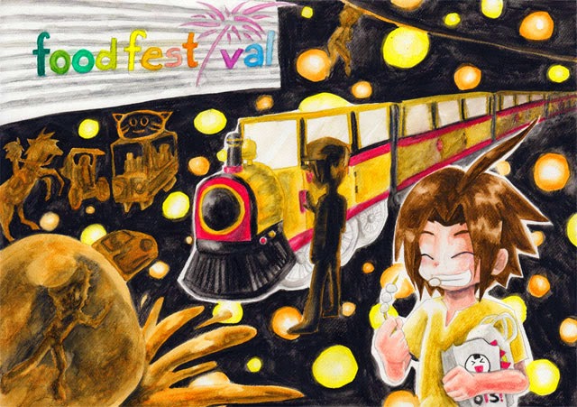
These three are my drawing class project. I am to make a conceptual drawing from famous places in Surabaya. In this city there are many famous places. I chose Zangrandi, Skate & BMX Park, and Food Festival.

So first things, I need to list all the things that has connection to the places. After that, it's time to create the drawing!

They are made on A3 paper with watercolor-based color pencils (aquarelable color pencils).

Zangrandi Surabaya - Pamz Conceptual Drawing
Zangrandi Surabaya

Skate & BMX - Pamz Conceptual Drawing
Skate & BMX

Food Festival - Pamz Conceptual Drawing
Food Festival
Cheers~!

Wednesday, June 4, 2014

Paddle Pop - Paddle the Joy and goes POP! (unofficial)

Cheers~!

Paddle the Joy and goes POP!

I made this slogan for designing a Paddle Pop advertising theme.

WALL'S is originated from United Kingdom and owned by Unilever. It is Unilever’s Heartbrand global ice cream business, which is currently sold in China, Hong Kong, India, Indonesia, Italy, Austria, Greece, Jordan, Lebanon, Malaysia, Maldives, Mauritius, Mexico, Pakistan, Portugal, Brazil, Romania, Philippines, Qatar, Saudi Arabia, South Africa, Spain, Singapore, Sri Lanka, Thailand, Turkey, United Arab Emirates, and Vietnam. The Heartbrand’s philosophy is Share Happy. In some countries, like India, most of Wall’s products are not milk-based ice cream, but rather vegetable fat based frozen desserts.

Paddle Pop is a milk-based frozen dairy snack, which is held for eating by a wooden stick that protrudes at the base and is known as a Paddle Pop stick. This brand has a mascot known as the Paddle Pop Lion, who first emerged in 1987. Over 97 million Paddle Pops are sold and eaten worldwide each year.

Advertising
Message: fun, excitement, love, and friendship.
Paddle Pop is all about fun and play, bringing kids to different angles of joy while enjoying the ice cream since ice cream “is a pleasurable food which brings smile and happiness.” The Paddle Pop Lion has a friendly face and adventurous attitude.

Advertising Campaign:
· 2007: Paddle Pop Cyberion
· 2008: Paddle Pop Pyrata
· 2009: Paddle Pop Kombatei
· 2010: Paddle Pop Elemagika
· 2011: Paddle Pop Begins
· 2012: Paddle Pop DinoTerra

Advertising Strategy + Media
1. Integrated Marketing Communication Objective
· Short Term
Making Wall’s Paddle Pop children’s number one favorite ice cream brand, increasing the numbers of products sold.
· Long Term
Making children (and their parents) happy, bringing smiles to children, for this brand to be remembered from time to time.
2. Integrated Marketing Communication Strategy
· Short Term
Visiting schools (kindergartens), attractive displays, children events, games in Paddle Pop website with gifts to win.
· Long Term
Continuous promotion, studying children interest from time to time.
3. Integrated Marketing Communication Media
· Short Term
Children magazine, poster, banner, advertisement in children websites and Paddle Pop website, games in Paddle Pop website with gifts, visiting schools (kindergartens), children events, POP (Point of Purchase): attractive displays.
· Long Term
Promotion goes continuously, changing the advertising media by adapting to the trend.

Big Idea
With the USP “Ice Cream with Great Flavors” and the ESP “Paddle The Joy & Goes Pop!”, all medias being used will be children-friendly, using colorful images to attract their attention.
This campaign will have the theme like that of American classic Indian, with a main character promoting the Paddle Pop’s products. The tagline “Paddle The Joy & Goes Pop!” will be present in all ads. The products being promoted are Rainbow Power, Choco Magma, Color Popper, Tornado Grape, Fruity Zap, and Berry Choc Lava.


Creative Execution
Above The Line:
· Billboard

Paddle Pop - Paddle the Joy and goes POP! (unofficial campaign) - Billboard - Pamz

· TV Advertising

Paddle Pop - Paddle the Joy and goes POP! (unofficial campaign) - TV advertising - Pamz


Through The Line:
· Website Ads

Paddle Pop - Paddle the Joy and goes POP! (unofficial campaign) - Website Ad - Pamz
The size is 800 x 200 pixels.

Below The Line:
· Poster

Paddle Pop - Paddle the Joy and goes POP! (unofficial campaign) - Poster - Pamz

· Shop Display

Paddle Pop - Paddle the Joy and goes POP! (unofficial campaign) - POP (Point of Puchase) display - Pamz


References
http://en.wikipedia.org/wiki/Wall’s_(ice_cream)
http://en.wikipedia.org/wiki/Paddle_Pop
http://info.paddlepop.co.id/
http://niganku.wordpress.com/2012/07/18/mengintip-sejarah-unik-terciptanyaice-
cream-walls/
http://walls.co.uk
http://www.paddlepop.co.id/
http://www.unilever.com.vn/our-brands/detail/Wall-s-ice-cream/313006/
http://www.youtube.com/watch?v=3u0Uo1Ma22M

Tuesday, May 27, 2014

IC!! Ice Cream - A Website

Good day!

Today I will post screenshots of my website: IC!! Ice Cream. Check it out here.

It is a final project of Web Development class. I designed this website myself with Adobe Dreamweaver and Illustrator.The site is not responsive, since my lecturer does not want it to be a responsive one. My theme is about ice cream. Look at the favicon! Ice Cream ~^o^~

This is the Home page:

IC!! Ice Cream Website - Home - Pamz
Home
I put the logo in big size in the upper part, so it will be the first thing the viewer will see. The menus are put under it. The concept is an ice cream place, with many blue (vanilla) ice cream boxes as the menus. When the mouse hover on the menu, it will change to strawberry ice cream with some chocolate sauce (like HOME up there).

The backgrounds are tiled pattern of ice cream C;

Here are more screenshots of the other pages:

IC!! Ice Cream Website - History of Ice Cream - Pamz
History of Ice Cream
IC!! Ice Cream Website - Gallery of Ice Cream around the world - Pamz
Gallery
IC!! Ice Cream Website - Toppings and Cones of Ice Cream around the world - Pamz
Toppings & Cones
IC!! Ice Cream Website - Contacts - Pamz
Contacts
These pages have different template than the Home Page. I put the menus on the left side. When the mouse hovers over them, the empty scoop will have a scoop of ice cream and chocolate sauce.

The information I put in the sites are all from other websites and they are all sourced.

Monday, May 19, 2014

Fiamma

This time I will post about a character design that I had created. Her name is Fiamma. Say hello :)

Fiamma - Pamz Character Design - Fire Cat Horn
Fiamma

Profile:
Specie: Fire Cat
Name: Fiamma
Gender: Female
Age: 54 years old
Occupation: Making volcanoes erupt
Favorite Color: Red-orange (the color of fire)
Favorite Food: Rock
Hobbies: Flying and watching other creatures from above
Likes: Fire, rocks
Dislikes: Water
Where does it live: in a volcano


Story

Fiamma is a baby fire cat that has lived for 54 years. She still has a long way to go to become a great volcano-erupt-master like her parents. That’s right, Fiamma’s job is making a volcano erupts. It is necessary to make a volcano erupts so that the volcano wouldn’t get overheated and blasted the entire world to an end. It has happened once, her parents had told her one day, and the world has changed from its previous full-of-dinosaurs state.

She isn’t too bad in making a volcano erupts, but her parents still need a better improvement for the magma from the volcano she erupted has always ‘not hot enough’ to burn the entire skin of the volcano. Timing is everything, they always say.

The family lives in one of the volcanoes on the west side. She loves fire and she often bathes in the magma for the whole day when she had no job to do. Her parents had scolded her for the splashes she had made unconsciously had splattered throughout the whole bathroom and broke several mirrors her mom loves so much to see her reflection after bath.

Fire cats eat rocks. They are hard enough to sharpen their fangs and had enough mineral and energy needed for their body. Fiamma’s favorite was the ones freshly baked by a volcano eruption. They’re more crunchy, warm, and delicious than ordinary rocks. Of course, her mom could always bake them in their magma kitchen, but still, they’re not the same.

The baby fire cat had learned how to fly a few years ago. Her father had explained some scientific stuff about fire, gas, floating, flying, and other stuff she doesn’t really understand. Her body is a flaming fire, she remembers her dad told her, control the outcome of gasses and she’ll be able to fly. He had her burning her body off from the study process, but it was worth it. She loves flying. Her parents had finally given her permission to wander around their volcano – not too far, of course, and she had to gone back before dinner. Fiamma likes watching other creatures from above. It’s funny to watch them interact with each other.

Fire cats are solitary creatures. They won’t interact with other creatures unless they really need to. Other creatures are actually afraid of their flames which might burn them alive when they get too close. One type of creatures that doesn’t afraid is the water type. But they also live in solitude, so Fiamma doesn’t see them often.

She hates water. She absolutely loathes water. It is blue, cold, and on top of it, it can kill fire. It is everything opposite of fire, which is red, hot, and burning. Her parents had warned her to stay away from all water-related – as if she would go near them – for the water can kill her flame and make her dying.

Fiamma has a horn. It is the red, sharp, pointed thing on her forehead. Her dad had taught her to use it for her self-defense against other threatening creature, but she rarely uses it. Her horn is scratchy and it needs to be sharpened every week. The same with her tail – which is made from the same material as her horn – though the tail can be wagged, like a dog.

Monday, May 12, 2014

Illustration for a Magazine Article

I was experimenting with other style, which is messy, has watercolor effects, and magazine-style illustration. I don't have a pen tablet, though, so this is created with a mouse in Adobe Illustrator.

The illustration is for an article about writing a book out of your imagination and the readers around who support and enjoy the book.

Writing out of your Imagination for the Readers to always support and enjoy it Pamz
Writing out of your Imagination


I can't say many people will like it because well, it's messy, but I love messy things! They are what art is about. Finding the beauty in various things :)

Tuesday, May 6, 2014

All it takes is Faith, Trust, and Pixie Dust

A typography poster with a quote from my favorite childhood movie 'Peter Pan'~

All it takes is Faith, Trust, and Pixie Dust Pamz typography poster Peter Pan
All it takes is Faith, Trust, and Pixie Dust
‘All it takes is FAITH, Trust, & Pixie Dust’

This sentence is taken from the movie ‘Peter Pan’ which is an encouragement sentence for the Darling’s children to be able to fly.

The magical and fairytale feeling is shown through the neon-like glow of the text and stars.

Since in ‘Peter Pan’ the children fly to ‘the second star to the right’, I add two stars in the upper right corner and I choose a background that shows the starry night sky.

“FAITH’ is written like that because faith is something strong, bold, and unwavering.

‘Trust’ is written like that because trust is a feeling that will come in wavy times, when people is unsure of themselves and will start believing.

‘Pixie Dust’ is something magical that comes from pixies (or fairies). I add some shines to show the glittering dust. The glow is also a little different from the others. This one is more scattered, like dust, not smooth glow.

‘All it takes is’ and ‘&’ is written in latin text as they have less importance than the other three, yet needed in the sentence. As this is a magical sentence, latin text will do better than separated-letters text.

Do you remember the time when we dream to fly up to the second star to the right?


~Pamz~

Monday, April 28, 2014

Yayoi Kusama

This was when we were learning about Yayoi Kusama. She is a Japanese artist who is famous for her dotted pattern. Our project was to make a composition with her style. We made this near Halloween so I made a spider web:

Spider from Circles influenced by Yayoi Kusama style Pamz
~Spider from Circles~
The project was not digital. It was made with blue, black, white, and silver paper. I cut them to circles and pasted them on an A3 paper.

PS: Sorry for bad pixelated picture //>.<\\

Tuesday, April 22, 2014

Archimboldo

This time is when we were learning about Archimboldo. He was a painter who forms human face from various things, like fruits, flowers, books, and many more.

I created a composition of a face from fruits. Here it is:

Archimboldo Composition of a human face forms with fruits and vegetables Pamz
Can't decide which background is better. What do you think?
Pineapple hair rules~

Wednesday, April 16, 2014

Impressionism

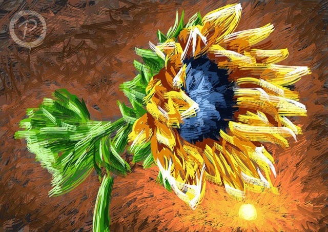
This is a project from several terms ago. We were learning about impressionism and we were to make an impressionism art digitally by Adobe Photoshop.

I chose this Sunflower, as a reference to Van Gogh.

Sunflower Impressionism Pamz

I'm going to post some more projects I've done while I'm in Raffles. Enjoy ;)